Movie Review: Renaissance
Topic: Film & TV
Posted: Thu, Oct 26, 2006 ![]()
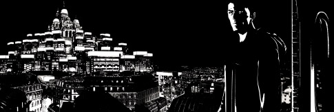
I didn't see last year's Sin City because it's violent, and I'm chicken. But I was very interested in the design of the thingthe black and white graphic-novel style. Last night I got me some of that, when I went to see Renaissance.
Renaissance is playing at the Landmark Keystone Artsand I just noticed its run there ends tonight! So, go now if you want to see it on the big screen...

OK, the story is nothing new. Rogue cop, a missing woman, her beautiful and tempestuous sister, a huge corporation with a benevolent leader (or is he?!?), the promise of eternal youth, etc. My friend noted that we've seen this all before, in both sci-fi and film noir. Set in Paris in the year 2054, Renaissance straddles the line between those two genres. I wish the story were more original, or more detailed, or more excitingor that there were any character development at allbut to some degree it doesn't matter, because the star of this movie is light.
With the exception of a few crayon strokes of color, this movie is entirely black and white. It must be hard to work with such a limited palette and still show depth. I noted that it truly was black and white, and there were not many instances of gray. So how to display positive and negative space while maintaining a sense of depth? The key is in the use of light throughout each scene.
The movement of light across the characters or the scenery allowed for, say, a large portion of background to be defined in an instant by the flash of a car's headlightsand then the characters and their immediate surroundings were lit. But because of that moment in the headlights, the scene had a well-defined placeit wasn't just characters on an empty background. The scene would change a moment later and something else in the environment would be highlighted, or they'd move from a tight shot to a wide one.
The animators did particularly well with reflections, transparency, and diffused light. Their futuristic Paris is multi-layered, with plazas made of glass so light shines through the levels with a realistic filtering effect. There are some evildoers in invisibility suits of some sort, and you can see the light barely bend around them while maintaining transparency. The hero runs through a sewer, and the light of his flashlight bounces off the wetness, soft at the edges. Faces are reflected in mirrored elevator doors or shiny car panels. Several times I caught myself thinking how it looked photographic, not illustrated. (I'll admit that there were a handful of moments when I wasn't paying attention to the dialogue, because I was busy looking at the pretty pictures!)
The detail is spectacularand the images aren't just painted in wide strokes. A wide shot across Paris shows light in hundreds of windows. A leather jacket shows the minute texture of the real thing. The hair, the cobblestones, each drop of water in a showerall rendered. And it's not just the intricate visuals that are wonderful; they made specific choices as to objects and design that rang true. My other friend noted one woman's shoes as something particularly well-suited to her character, and was impressed that such a detail was included.
The designers didn't cheat on details in any way. The whole wide-screen frame is filled with movement; it's never just a blank background where only the key characters appear. There was constant "camera" movement that made it feel more like something filmed with a SteadiCam. There were no long scenes filmed from a single point of view, a tactic which I think is the animator's easy way out. (And which is common on shows like The Simpsons or Family Guy.) Some of the images felt like helicopter shots, zooming over the city while maintaining perfect perspective.

Walking is a hard thing to animate; it seems difficult to manage the timing of the legs with the consequent movement of the upper body, all while putting the perceived center of gravity in the right place. In anime or other cartoons, it often looks like they're slidingbut for the most part, this film nailed it, because they used motion capture. We've seen mo-cap combined with animation to create characters like Gollum, but to see it with this highly stylized black-and-white graphic novel feel is new (to me). And there were only two or three brief moments when I felt like the faces looked like something out of a video game; for the other 99% of the time, they did a great job of creating natural-looking faces with nuanced movement.
A note on the voices: Only Jonathan Pryce's voice was recognizable to me, and it was weird to hear his voice coming out of his character's mouth! Somehow it doesn't seem so strange when an animated movie has recognizable voices for raccoons or fish or candlesticks; when it's a known voice with a different human face, there's a disconnect. The cop is voiced by new 007 Daniel Craig, and Ian Holm and Catherine McCormack provide voice talent as well.
The mediocrity of the storyline and the lack of character development contribute to my rating here. But this looked incredible. Any fan of graphic novels or pop art should go see it. I suspect it will lose a lot in the translation to the small screen, so if you can make it to Keystone Arts tonight, do.
Renaissance: ![]()
TrackBacks
TrackBack URL for this entry:
http://www.indyscribe.com/cgi-bin/mt-tb.cgi/369
Categories
- About Us
- Board and Video Games
- Books
- Day Trips
- Events & Festivals
- Film & TV
- Geek Bling
- History
- Hoosier Oddities
- Indianapolis In the News
- Indianapolis Living
- Kids' Stuff
- Local Attractions
- Local Celebrities
- Museums and Visual Arts
- Music
- Night Life
- Photos
- Restaurants
- Shopping
- Sports
- Theater
- Transportation
- Weather

Comments
1. Nov 5, 06 09:26 AM | J. Rutherford said:
I so spaced this - how was the movie ? Scanner Darkly wore on me after a while. Sin City was so violent I was nauseous, it was almost as violent as Passion.
Borat to the rescue !
2. Nov 6, 06 06:57 AM | Rachel Wolfe said:
I had a terrible time staying awake during A Scanner Darkly, I thought it was terrible. Renaissance was much better...